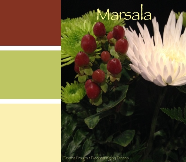
It just hit the cyber waves, Marsala, Pantone’s Color of the Year for 2015. I really have a boat load to say about this color but just wanted to send this one out.
Now this color will show up in an assortment of shades and tones on the internet, other than Pantone’s website of course, because it’s hard to find it!!! I think as long as the over-all color is captured, it’ll be ok to call it “Marsala”. I don’t think we have to be too picky about it. Just like Pantone’s Radiant Orchid, as soon as someone saw “pink” they labeled it Radiant Orchid and sometimes it wasn’t even close. Getting close is key, especially with Marsala.
See how beautiful? My husband bought me flowers yesterday and I had to chuckle when I saw a touch of Marsala. Keep this color updated and new by pairing it with unique colors. Try different combos until you find a NEW color palette, not one that we’ve seen 1,000 times before.
WHY WILL THIS COLOR WORK?
I think since Pantone’s Color of the Year for 2014 (Radiant Orchid) was just to feminine for both fashion and retail. Marsala is a color that is more appealing to both sexes which will reflect well in sales. It’s a color that will very buyable in fashion, make-up as well as just about anything you’d want to have in your home … and it’s don’t have to be “just accessories”.
FINISHES
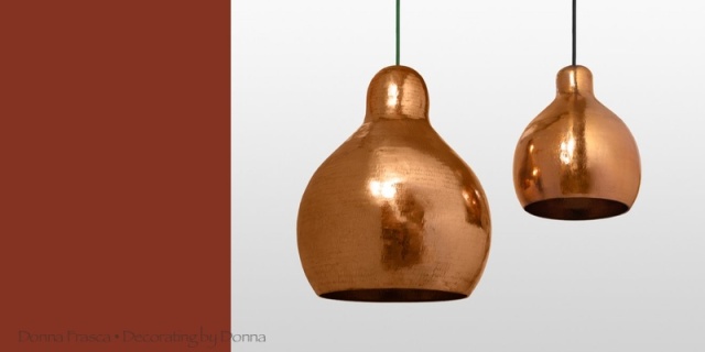
Copper,copper and more copper!!!! Keep the warmness of Marsala going with warm finishes. Using brushed nickel or anything in the silver family will really not look the best.
WHO WILL USE MARALA IN THIER HOME?
The great thing about this hard-bodied hue is it’s appeal to both men and women. For men, think man cave, leather furniture and dark wood surfaces.
For women, the possibilities are endless really but key is to keep undertones warm and clean. I’d also shy away from using any type of gold, yellow yes, gold no, so we don’t throw this back to the Tuscan look. Also watch those muted hues because it can date this color in a heart beat. Get your color chips out and start putting them together until one resonates with you.
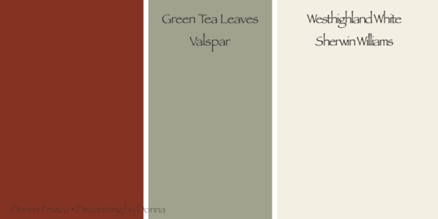
Now you cannot tell me that this color palette isn’t pretty. Even if you use “Marsala” that is closer to it’s browner undertone, this will still be awesome. As a matter of fact, I have these colors in my home. The Green Tea Leaves is crazy gorgeous but you really have to be careful what you pair it up with. Marsala is perfect BECAUSE of the brownness in it. Too much red and it’ll look Christmassy.
So much more to come on this color. I love it.


Hi Donna,
Great ideas for using #Marsala. I will keep this post in case a client wants to use the color. Frankly, it leaves me cold.
Thanks Rissi but it shouldn’t leave you “cold” if you use “warm” colors. Let me know if you need help. Merry Christmas!
Pingback: Lighting Ideas for Pantone Marsala - Lights Online Blog