So what paint company should you use? Read this before you decide.
There are four main paint companies that are used here in the Charlotte area. In alphabetical order, it’s Behr, Benjamin Moore, Sherwin Williams and Valspar. Yes there are others but these are the four main paint companies that my clients have been asking for and that I use most often.
Some are better than the others. Come read the nitty-gritty about these paint brands and find out why some are good and some need to do a little more homework.

This such a huge subject and I literally can go on for pages and pages but I think the best way to approach this is just to list all the points in bullet form. I’ll try to keep it short and to the point. I think at one point I will expand on this post but for now – it’s going to be just a summary. Also keep in mind that this post is my opinion and based on studying paint trends in my area of Charlotte for the past 7 years.
I do want to add that I’ve worked with all of these paint companies for both my personal use in my home and for my clients. The two brands that I’ve used in my own home are Valspar and Behr. I’ve also worked with the two major box stores way back in the day so I know a lot about Valspar and Behr paint. Sherwin Williams and Benjamin Moore, well they just stand on their own 🙂
I’ll start in alphabetical order with Behr.
BEHR
- Behr has a HUGE paint deck. Now this is ok if you’re a homeowner but it’s extremely cumbersome to carry around if you’re a Designer. Perhaps breaking it down to smaller decks and into some rhyme or reason would be better.
- About the colors. Behr paint colors are very tutti-fruity looking. It’s almost like looking into a 5 gallon bucket of sherbet ice cream which is good if you need color for a kids room but this color palette, doesn’t rate very high on the likable scale for the home.
- However, hey have some neutrals that I just love. I’ve used Raffia Cream in my home and for clients many times. Homes cannot live on neutrals alone. There are some other faves but not enough to hold a strong presence in the color world – at least for me.
- … just a few colors I’ve used …
- Gobi Desert is a nice basic taupe that is very close to a classic khaki and also have used that for clients and is great for the people who just need to neutral for staging or selling purposes. Like any paint brand, be careful of the undertones here, many of them have the dreaded pinky undertone such as Chocolate Froth so keep the name in mind when choosing your colors.
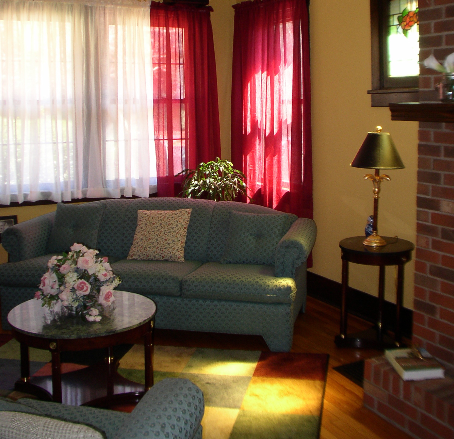
- Speaking of paint names, Behr has the BEST paint names. The name and colors for the most part, really match up. Warm Muffin, which is a great gold by the way, somehow just looks and feels like it’s name. Feeling colors? Yes I just said that. Applesauce is just yum and a nice cheery yellow that I’ve used for kitchens. While I’m talking about golds here, I have to add that Gold Buff (see picture) is one of my favorite golds across the board. I used it in my living room when I lived in Pittsburgh. I had extreme light challenges in the Burgh and gold was just a life saver. I highly, highly recommend this gold to lighten and brighten your room. Oh and also if you have an aqua sofa and when nothing else matches this gold is perfect.
- Home Song is a bit on the neon side but it’s a great color for a kids bathroom and is actually in my kids bathroom. When we moved into our Charlotte home, I told them that they can pick their own color and they went right to that green. Green is a great color to use when you are sharing a bathroom with both a boy and a girl. Super fun color, check it out. Outback is another great green but more on the adult side. I used it at one point in my kitchen and it looked great next to cherry cabinets.
- Still on the “I likey” colors of Behr, I also have Pebbled Courtyard and Stone Brown in my dining room but be warned, these have pinky undertones so you have to know how to utilize these colors to make them work.
- Concluding Behr, some paint colors go on better than some which is weird but it all boils down to the make-up of thier paint.
- As far as price, Behr is affordable but for some reason, not one of my clients have ever asked for Behr paint or wanted to use it even if I mentioned some colors that would work. That’s an interesting factoid.
- Next in line …
BENJAMIN MOORE
- Now Benjamin Moore has a really nice selection of colors. They have the Classic, the Affinity Collection, Color Stories and Color Preview.
- It’s the 2nd most popular paint company asked for by my clients.
- Great quality paint.
- Nice selection of colors.
- Love the Color Stories Collection but it’s a hard sell because of the price.
- I’ve used most of Ben’s colors and there’s really not one that stands out because they are all so good.
- Love the Historic line.
- Some of the most beautiful off whites – hello White Dove, you know you’re it 🙂
- Your blues have been dominant in my Coastal Color palettes for a really long time and that’s for a reason. From Quite Moments to Gray Owl you’ve been keeping homes beachy for years.
SHERWIN WILLIAMS
- Although Sherwin Williams is the most asked for paint brand across the board, I have a few beefs about this company but first …
- Great quality paint and that is hugely important for my clients.
- Now about the colors – for me, there’s a small section of the entire paint deck that I will gravitate to. I use their ESSENTIALS a lot because the grays are pretty awesome and also play a huge roll in my coastal color schemes.
- HIGHLIGHTS – not a fan of that section because, well their highlights are just an odd fit into my color schemes. I’m sure they work for others but keep in mind I’m talking about how these companies work for me based on my experience.
- FUNDAMENTALLY NEUTRAL – this seems to be the main section of colors that I use but I wish SW would retire pages 18-21. The are just dated, dull and colors that I refuse to use in my clients homes. Model homes don’t even use them anymore.
- Now here’s where it gets sticky and it’s because of paint contractors. It seems that most of the time I get locked into using Sherwin Williams because my clients painter uses Sherwin Williams. Most of my clients are wonderful and say I can use whatever paint company works best for their home but I respect my clients budget and try to keep costs down by working with their painters. Painters are my worst enemy when it comes to color palettes but it is what it is.
- LOVE the CONCEPTS OF COLOR deck. They have a really nice selection of neutrals and also contains my most favorite white in the world which is Westhighland White. As you can see from this picture, it also has some great blues and grays. Many times this little deck goes unnoticed but make sure you check it out – its great to keep in your purse too!

- About color decks. Sherwin Williams is in dire need of coming up with more paint decks – PLEASE!!! Also please stop creating “new” paint decks with the old colors you already have. Come up with a Coastal Color paint deck and design some NEW colors that have more than just blues and grays. As I’ve been saying for years, coastal colors are more that just blue and gray – I’m a Long Island girl, I grew up with these colors. Come up with a HOLISTIC color palette because that is what people need. People need these decks and SW, I’ll be more than happy to work with you on that 😉
- This is probably a really minute point but to make, it makes my color consultations run a lot smoother. Thank you for putting your page numbers on top of the deck. Some paint companies have them on the bottom where the deck connects and that makes looking up colors hideously annoying.

VALSPAR
- Well let’s just start this section by saying that Valspar, IMO has the best colors for the home. If I had to use just one paint deck for the rest of my color career it would be Valspar – BUT BASED ON ONLY THEIR COLORS.
- Love your greens. Green is a really hard hue to find for the home because it’s either too pea green, too minty to dull or too neon. When I need the best green, it’s Valspar.

- Valspar also has a really cool section of lavender grays. Very classy, very stylish. Winter Calm is sexy and these are perfect colors for the master bedroom.
- Your spicy oranges have been in various rooms of my home for a long time. There are other colors that are in my home from office, living room and kitchen but I can’t give all my secrets away. Gotta be good in they’re in my home because I’m a fussy pants when it comes to color. Just with the rest of the population would catch on.

- Now a bit on the downside. About Signature – it’s way to thick! Is that good? No. One gallon of Signature didn’t even cover my small office. You wind up using twice as much paint to cover the same amount of area most other paint companies cover.
- Your Ultra Premium paint is great but I understand it’s going away and now we are forced to use Signature. That’s bad because I will not use Signature paint – ever – and that’s unfortunate because I love your colors.
- LOVE your Historic colors – they are of course Historic for a reason.
- LOVE your Eddie Bower color collection Tomato you know you’re the best red!
- You have a poor presence on social media. I’ve tagged you on many, many tweets and posts – hello because I love your colors – but I never hear back from you. Not a good way to treat Designers who actually support your colors when most are tweeting about Sherwin Williams and Benjamin Moore.
- I can never seem to get your color visualizer working which is unfortunate for you because since I write about color, I need to have visuals and heavily rely on those tools. Behr has a great paint visualizer which I use a lot. Sherwin Williams has one too but don’t really like it because their rooms are horribly dated looking. Valspar, you have a chance, get in gear.
- Looking forward to seeing what you’re doing with Sherwin Williams.


Pingback: It’s Spring Home Improvement time! Get Your Coastal Color Palette Ready! | Decorating by Donna • Color Expert
Pingback: Benjamin Moore Just Has the Best Colors for a Coastal Color Scheme | Decorating by Donna • Color Expert
I have a small and unusual home. Been experimenting with paint colors, till and error, and learning about paint and color. I recently decided to try a Valspar color called comet dust. I like a lot of their colors but I’m afraid because of the poor reviews online for Valspar paint quality. I’ve used FB, SW, BM, quiet home paints, glidden. Glidden looked plastic to me. The rest were fine. I care about the looks/texture/color more than price because my hose is small. Which Valspar product should I use? Have you had Valspar colors mixed in another brand successfully. Light grays can be temperamental as far as the right base goes? What do you say?
I tried just about every paint brand in my home. Most of my home is Valspar and I’m happy with the results. Valspar’s “Signature” was horrible! I live the Ultra Premium. Sherwin Williams (Emerald) and Benjamin Moore are top notch – I’d stay away from Behr.